This is probably by FAR the question I get asked the most on my page: How to create a theme for your Instagram feed.
First of all I just wanted to mention that I don’t actually think my feed is that great, I know we are always our own worst enemy/biggest critic when it comes to these things and I am so SO flattered (and very surprised!) that you guys come to me for advice on your feeds because I am by no means an expert, far from it actually. I have times when I love my feed, times when I hate it, and times where I wish I could just get rid of the theme altogether, maybe I will one day, but for now I am quite enjoying the challenge of creating something pretty and put together.
To be honest apart from the fact that it is aesthetically pleasing, and somehow gives me a calm relaxed feeling when I scroll through it, maintaining an Instagram theme can be a complete pain in the ass. It can be incredibly frustrating, quite restricting, requires a bit of advanced planning, and it is also very easy to become overly obsessed with it. It has however taught me a great deal of discipline and self control LOL, not being able to upload that picture that I love because it doesn’t fit my current theme takes self control and discipline I promise you! And for those of you reading this thinking she needs to relax it’s just a theme it’s not that deep then this post is not for you, see yourself out 😉
Here, with the advantage of hindsight, I will try explain how I maintain my theme, along with a few tips I have learnt on the way, and some things I wish I had done before starting mine!
Decide your theme:
If you don’t already have a proper idea for what you want your theme to look like, use what you have around you. Take a look at your current feed or all of the photos you have taken recently, or your bedroom, or locations that are near to you and easy for you to shoot in, find a common theme in them and try to maintain that – it’s the best way to make sure you stay consistent because you’re not making it too hard on yourself. Consistency is key with any feed, themes only look good once you have kept them up for a while and it just becomes part of your page. My feed started off grey because that was how most of my pictures were even before I decided I want a theme, then I just started changing things around but the grey theme always stuck because naturally that was how I had shot a lot of my photos to begin with! Your theme doesn’t actually have to be one particular colour like pink or grey, it can be a certain “shade”, for example pastel colours or bright colours, or muted colours, or a certain “tone” for example warm tones, or cool tones, these ones are usually easier to keep up with because you can edit the colours in your photos to make them fit that theme. Play around with it and find one that works for you and doesn’t restrict your creativity too much.
Plan your content in advance:
Once you’ve decided your theme, whether that’s pink or blue or warm or cool etc… envision it in your mind or write it down and start planning it. Almost like a mood board, find locations to shoot and outfits (or props and objects depending on the type of page you have) that fit the “mood” you’re trying to achieve, it makes it so much easier in the long run. When you actually come round to shooting your photos keep your “mood” in mind so you know what kind of picture you are trying to get!
Download a feed planner:
Download an app to help you plan your posts in advance, I use one called Preview, it’s very simple you just upload your photos to it so you can see how they all fit together before you upload them to Instagram! It pays to be a couple posts ahead at all times.
Find an editing technique:
Once you have shot your content you will most likely need to edit your photos. Whether it’s on your laptop or through apps on your phone, find a technique that will be easy for YOU to keep up with. Your colours don’t all have to match when you plan your feed but the TONES in the photo should be similar to the pictures around it. One way a lot of bloggers do this is by using the same filter on all their photos, or using the exact same settings on the brightness, saturation etc… this never worked for me though I know it works for a lot of bloggers. I edit each photo of mine as it comes then add it into my feed planner, see if it works, see what I don’t like, then re-edit until I get it right, it is a much longer process but somehow it gives me more satisfaction. Some great apps to use are Lightroom, Facetune and Snapseed, these are all very easy to use and the tools are generally self-explanatory. If you get stuck there is A LOT of help available online too so just take out a couple hours to educate yourself and find an editing technique that works for you.
Don’t obsess over it:
It’s very easy to fall into the trap of obsessing over every tone, every colour, every object, in your photo when you get into your theme, DON’T DO IT. It will not only take away ALL the fun but will drive you mental and waste your time. People won’t notice, focus on the bigger picture, as long as the picture goes with the few pictures around it, it will fit and won’t look odd, especially when you have a few more rows of content up, TRUST ME.
Don’t be afraid to have clean ups:
Every couple of months I do a little swipe through my feed and archive any posts that I think don’t quite fit. ARCHIVE, don’t delete! Because often I come back and put the same photos back in again, it helps to make me feel like I have more control over it and it’s kind of therapeutic!
Be consistent:
It’s inevitable that you will start getting irritated with your theme, having to restrict what you post, re-shoot content that doesn’t fit, restrain yourself from posting a really amazing photo because it doesn’t fit in with your theme, it gets annoying sometimes, but try not to give up. Remind yourself of all the reasons you LOVED this theme to begin with, all the reasons you chose THIS as the mood for your page. Take some time out or even take a break to think about new ideas that you can incorporate into your current feed, ways to create a “different” look without completely straying from your theme, so you don’t get bored.
Don’t be TOO afraid to change it:
If you’re REALLY not feeling your theme anymore, and you are 100% sure it’s not working for what you want to achieve anymore, instead of forcing yourself to carry on and risk hating it altogether, change it! Plan a new mood, shoot content for the new look that you want to give your page, don’t restrict yourself too much, this is meant to be FUN, it’s YOUR page, it’s YOUR creative space, be disciplined so you don’t give up too easily, but don’t become a prisoner to your theme, plan a “transition” from one feed into the other, some people like to use blank posts to create a sharp divide between the new theme and the old, I prefer to play around with my posts and transition slowly from one to the next, both look good it is really just personal preference. Make sure you have enough content planned that your new feed actually ends up looking like a feed and not just a line of random posts.
And finally – don’t compare your feed to others:
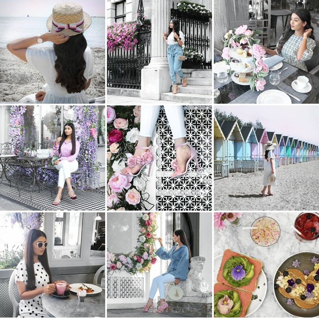
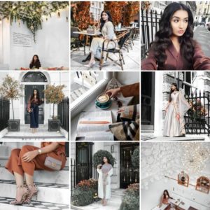
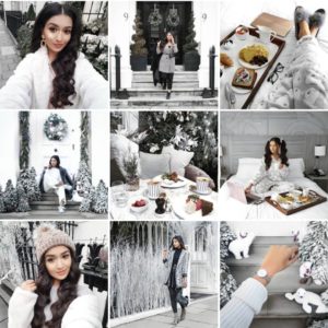
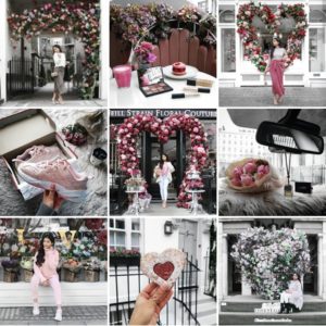
The second you start trying to make your feed look like someone else’s, is when you mess up. Firstly, you’re splitting your audience, if your feed looks like someone else’s why would they follow you and them both, they will follow one or the other, you’re not going to buy two of the same coat so why would you follow two of the same feed. Make it different, make it YOU, put your personality into your feed, people will follow you because they will feel the authenticity in it, no-one likes a bootleg. Like I said my feed started off just grey because that was what the majority of my pictures were, but I also loved having colour, so I decided to make my feed grey, with ever changing colour themes, sometimes pink sometimes blue, orange, green, white, right now I’m doing seasonal colours, so I did summer, autumn, winter, now I’m starting spring, ever changing so I don’t get bored of it. The point is like I said this is YOUR creative space, make it about YOU and no one else! Just YOU.
YOUR personality, YOUR style and YOUR mood, and most of all have FUN with it!
Hope you enjoyed this post and it was useful for some of you at least! If you have any questions or any more tips to add please comment them below! And as always please like, share and follow me on Instagram if you don’t already! Love you! xx

4 thoughts on “How To Create A Theme For Your Instagram”
This was a good read! I always wondered how you got your feed looking so beautiful!
Thank you so much!! So sorry I missed your comment!
Very good insight to what goes on behind the scenes of such a page. Structure of content that needs to be planned out etc but you make it look effortless. Your theme is great by the way 😊
Thank you so much!!! I don’t know how I missed these comments but thank you that means so much!!